
Responsive web design is no longer optional—it is the foundation of modern user experiences. With screens ranging from compact smartphones to ultra-wide monitors, developers need layout tools that adapt effortlessly. Among the most powerful solutions available today are CSS Grid and Flexbox, widely used by modern frontend teams including HTML5 Developers building scalable, standards-compliant interfaces.
Both are widely used, both are officially supported across modern browsers, and both solve layout problems—but they are not interchangeable. Choosing the wrong one can lead to unnecessary complexity, fragile layouts, and maintenance headaches that slow down teams trying to Speed Up Web Development.
This in-depth guide will help you clearly understand when to use CSS Grid, when Flexbox works better, and how to combine both intelligently for responsive layouts that scale gracefully and help teams Build Faster Web Apps.
Why Choosing the Right CSS Layout Method Matters
Layouts are more than visual arrangements. They directly affect:
- Page readability
- Content hierarchy
- Performance
- Maintainability
- Mobile usability
A layout system that looks fine on desktop but breaks on mobile increases bounce rate and hurts SEO. Understanding Grid and Flexbox allows you to design with intent, not guesswork—an approach commonly adopted by experienced Tailwind CSS Developers working on utility-first design systems.
Understanding the Core Philosophy of Flexbox
Flexbox, short for Flexible Box Layout, is designed to manage one-dimensional layouts. That means it controls layout either in a row or a column—but not both at the same time.
What Flexbox Does Best
Flexbox shines when you need to:
- Align items in a single direction
- Distribute space dynamically
- Handle content of unknown size
- Reorder elements easily
It focuses on content-driven layouts, where elements adapt based on their size and available space.
Key Flexbox Concepts Explained Simply
Flexbox works around two axes:
- Main axis (row or column)
- Cross axis (perpendicular direction)
Key properties include:
display: flexflex-directionjustify-contentalign-itemsflex-wrap
These properties allow flexible spacing and alignment without relying on floats or positioning hacks.
Real-World Use Cases for Flexbox
Flexbox is ideal for:
- Navigation bars
- Buttons with icons and text
- Cards inside a horizontal scroll
- Centering content vertically and horizontally
- Toolbars and menus
If your layout flows in one direction, Flexbox is usually the cleanest solution.
Limitations of Flexbox You Should Know
While powerful, Flexbox has boundaries:
- Not designed for full page layouts
- Harder to manage complex grids
- Alignment across rows is limited
- Requires nesting for advanced structures
For large-scale layouts, Flexbox alone can become difficult to maintain.
Understanding the Core Philosophy of CSS Grid
CSS Grid is built for two-dimensional layouts, meaning it controls both rows and columns simultaneously.
Instead of arranging content based on items, Grid focuses on the layout structure first.
What Makes CSS Grid So Powerful
CSS Grid allows you to:
- Define rows and columns explicitly
- Place elements anywhere on the grid
- Create complex layouts with minimal code
- Maintain consistent spacing across breakpoints
It gives developers layout control without excessive nesting.
Essential CSS Grid Concepts Made Easy
Key Grid features include:
display: gridgrid-template-columnsgrid-template-rowsgrid-gapgrid-area
You can visually map your layout before placing content, making it ideal for structured designs.
Practical Use Cases for CSS Grid
CSS Grid works best for:
- Page layouts
- Dashboards
- Image galleries
- Blog post structures
- Product listing pages
Any layout that requires both horizontal and vertical alignment benefits from Grid.
CSS Grid Limitations to Consider
Despite its strength, Grid may not always be the best choice:
- Overkill for simple layouts
- Learning curve for beginners
- Less intuitive for content-driven alignment
For small UI components, Grid can add unnecessary complexity.
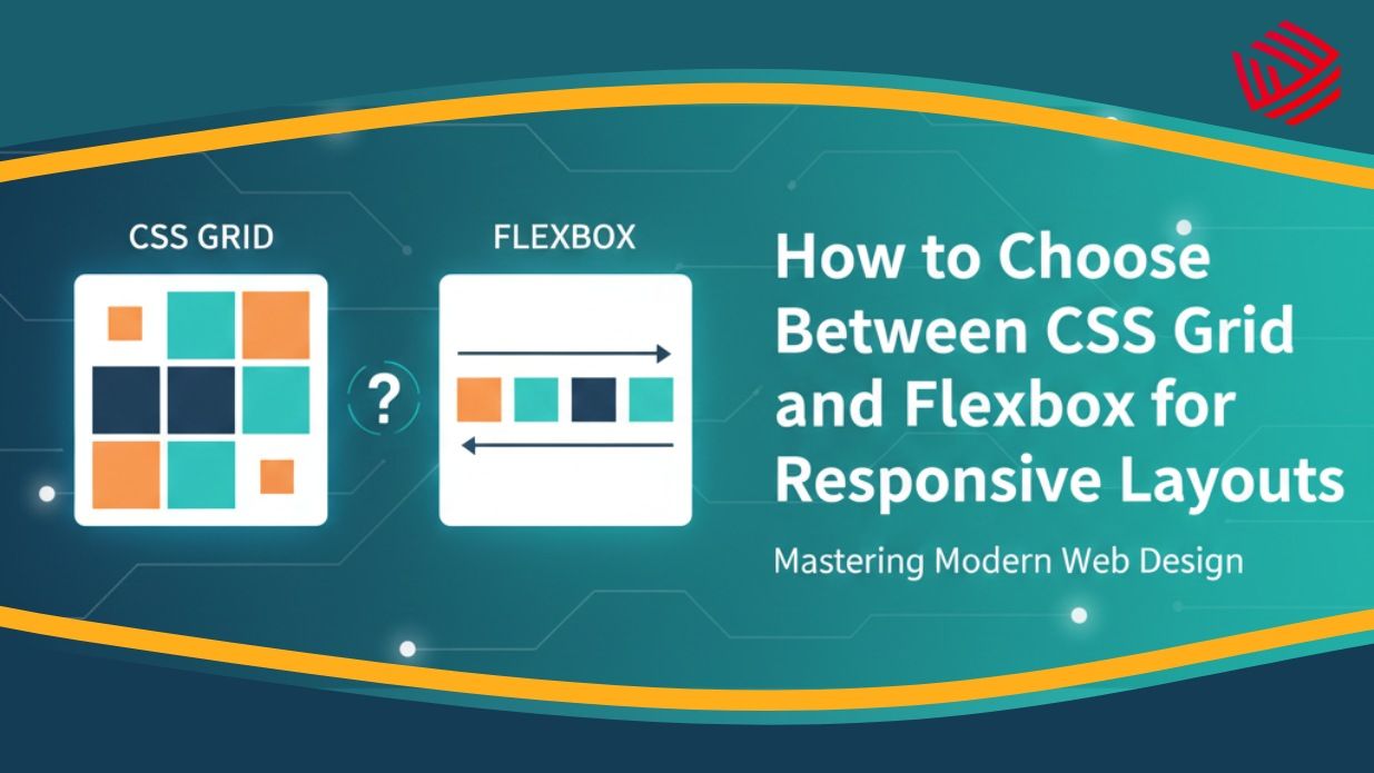
CSS Grid vs Flexbox: A Clear Comparison
| Aspect | Flexbox | CSS Grid |
| Dimension | One-dimensional | Two-dimensional |
| Best For | Components | Layouts |
| Content Flow | Content-first | Layout-first |
| Complexity | Simple to moderate | Moderate to advanced |
| Nesting | Often required | Minimal |
This comparison highlights that neither is better universally—each excels in different situations.
How Responsive Design Changes the Decision
Responsive layouts are about adaptability, not just resizing.
Flexbox responds naturally to content changes, making it ideal for:
- Dynamic elements
- Variable text lengths
- Small screens
- CSS Grid excels at:
- Rearranging layout sections
- Maintaining visual balance
- Managing breakpoints cleanly
Both approaches support performance-focused layouts that Reduce Frontend Load Time when used correctly.
When to Choose Flexbox for Responsive Layouts
Use Flexbox when:
- Elements flow in one direction
- Content size is unpredictable
- You need quick alignment
- Layout logic is simple
Examples include mobile menus, feature lists, and CTA sections.
When CSS Grid Is the Better Choice
Choose CSS Grid when:
- Designing full page structures
- Managing multiple content sections
- Creating complex responsive grids
- Reducing nested containers
Grid is perfect for modern websites with structured content.
Combining CSS Grid and Flexbox the Right Way
The most effective layouts often use both together.
A common strategy:
- CSS Grid for page structure
- Flexbox for internal components
This approach keeps layouts clean, readable, and scalable.
Example Strategy Without Code
- Grid defines header, main content, sidebar, footer
- Flexbox aligns items inside navigation and cards
- Responsive changes handled through Grid areas
- Flexbox manages spacing inside components
This combination mirrors how professional front-end teams work.
Performance and Maintainability Considerations
Both Grid and Flexbox are performant, but maintainability matters more long-term.
Grid improves maintainability by:
- Reducing nesting
- Clarifying layout intent
- Simplifying breakpoint management
Flexbox improves maintainability for components by:
- Adapting to content changes
- Avoiding rigid sizing
Choosing correctly saves time and reduces bugs.
SEO and User Experience Impact
Layouts influence:
- Content readability
- Scannability
- Mobile friendliness
Google favors pages where users can easily consume content. Clean layouts created with the right CSS method lower bounce rates and improve engagement.
Common Mistakes Developers Make
Avoid these pitfalls:
- Using Flexbox for full page layouts
- Forcing Grid for small components
- Over-nesting containers
Ignoring layout intent
Understanding the purpose of each tool prevents these mistakes.
Future-Proofing Your Layout Choices
CSS Grid and Flexbox are both future-ready. However:
- Grid continues evolving for layout systems
- Flexbox remains essential for components
Learning when to use each ensures your designs remain adaptable.
Final Decision Guide (Quick Reference)
Ask yourself:
- Is this layout one-directional? → Flexbox
- Does it require rows and columns? → CSS Grid
- Is it a component? → Flexbox
- Is it a page structure? → CSS Grid
Clear answers lead to clean layouts.
Conclusion: Make Layout Decisions with Confidence
Choosing between CSS Grid and Flexbox is not about preference—it’s about purpose.
Flexbox simplifies alignment and content flow.
CSS Grid empowers structured, responsive layouts.
When used thoughtfully, they complement each other and elevate your design quality.
Mastering both gives you the confidence to build responsive websites that look great, perform well, and scale effortlessly.


